Selected outcomesIndependent concept
Juiced
A local juice brand's modern-retro personality, translated into an interactive storefront.
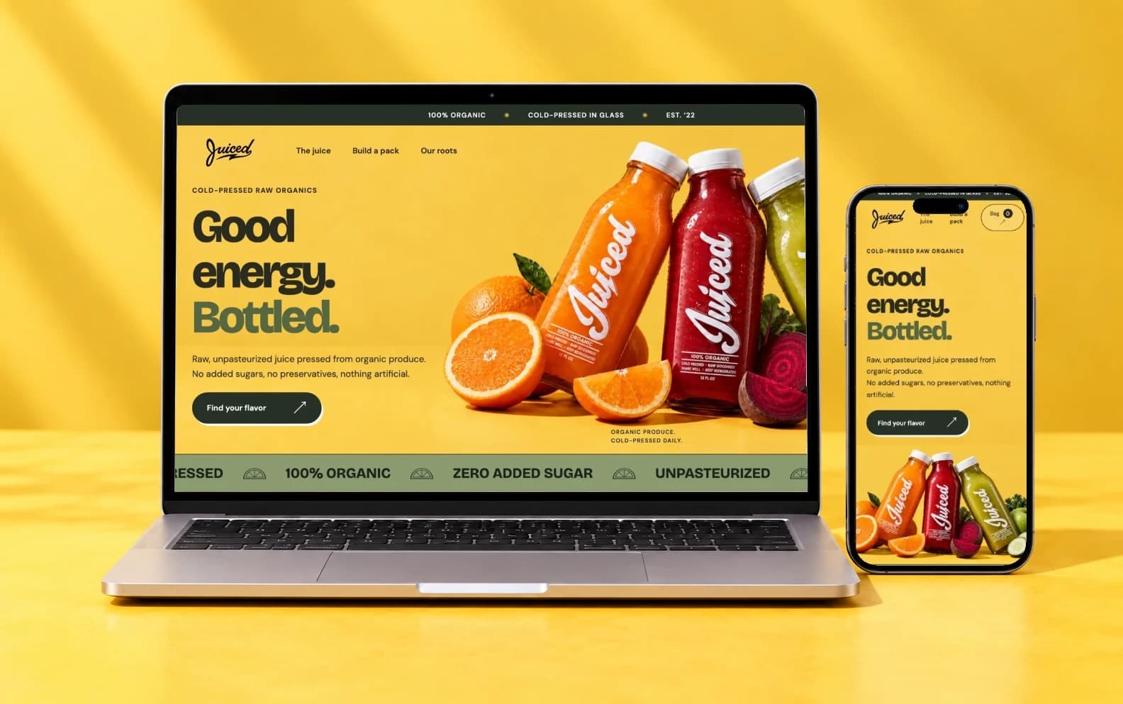
- Role
- Visual direction, UX and front-end, with AI-assisted imagery and interactions
- Timeline
- Concept to interactive build, 2026
- Stack
- HTML, CSS, JavaScript modules, SVG, Web Animations API
Quick read
Problem
Juiced's brand is bold, retro-mod and full of personality. Its website was a generic template that captured none of it and was hard to navigate.
Role
I led visual direction, typography, color and UX flow, and directed AI to accelerate imagery and complex interactions.
Intervention
A campaign-style storefront in a fresher, fruitier palette, leading into flavor discovery and a visual six-pack builder.
Result
A fully interactive, responsive concept, from the first scroll to a reviewed bag.
Interactive concept
Flavor discovery, a visual six-pack builder, and bag review in a responsive front-end experience.
Deep dive
Starting with an existing brand1 of 8
Starting with an existing brand
Juiced's identity already has a strong point of view: retro-mod, 70s-inspired graphics paired with bold typography and modern branding. Its website carried none of that. It read as a generic template, and it was hard to find your way through.
I saw an opportunity to give the brand a storefront as distinctive as it is, with a clearer path through the products. The project was self-initiated, so the commerce model and product assortment are my proposals.
A fresher take on modern-retro
I kept the modern-retro vibe and the brand's own marks, its script logo and seal, and refreshed everything around them. To signal freshness, I brought in fresher, fruitier colors: lemon yellow, cherry red and muted green against clean white, with each flavor carrying its own fruit tone.
Bricolage Grotesque carries the bold, mod-inspired display type, with DM Sans for navigation and reading. Rounded controls, offset button shadows and my own lemon-slice vectors keep the interface playful without losing its polish.
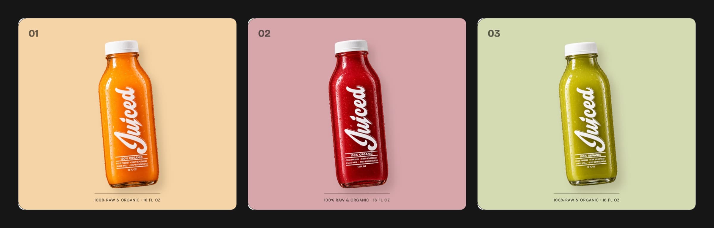
AI-assisted campaign imagery sets the tone in the hero, with separate compositions for desktop and mobile so the bottles always sit beside or below the headline.
Structuring the experience
The page moves from introduction to flavor discovery, pack building and brand story. The hero's main action goes straight to the flavors, and the nav jumps to the lineup, the pack builder and the story.
The flavor explorer shows one product at a time. Choosing a tab changes the bottle, background color, ingredients, taste notes and price together, so every flavor is compared in the same place.
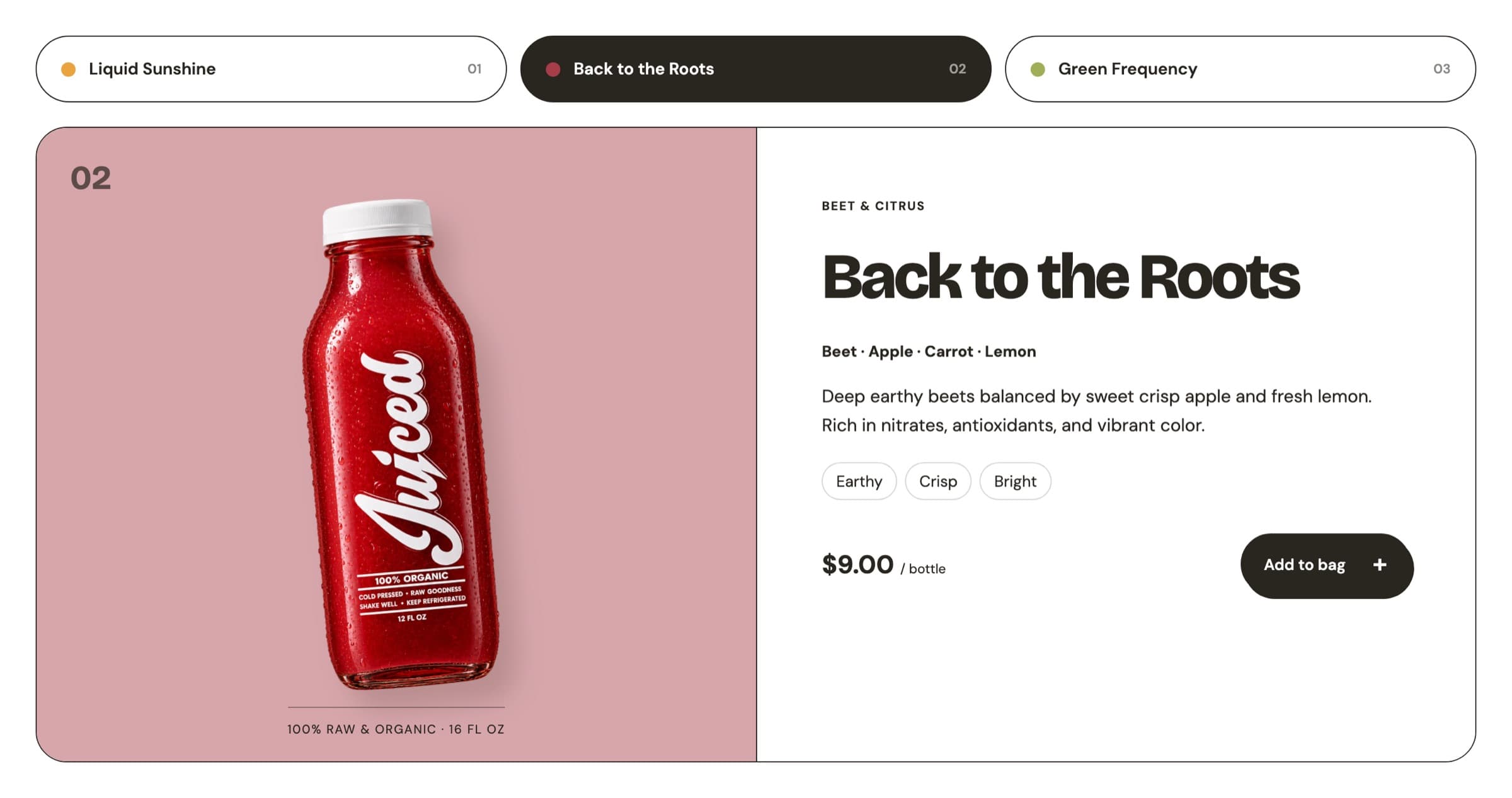
Visitors can add a single bottle or build a six-pack, and both land in the same bag.
Making a six-pack visible
The custom six-pack is a proposed sales mechanic, developed with AI and built into the page's flow and visual system. Its core idea: you should see the pack as you build it.
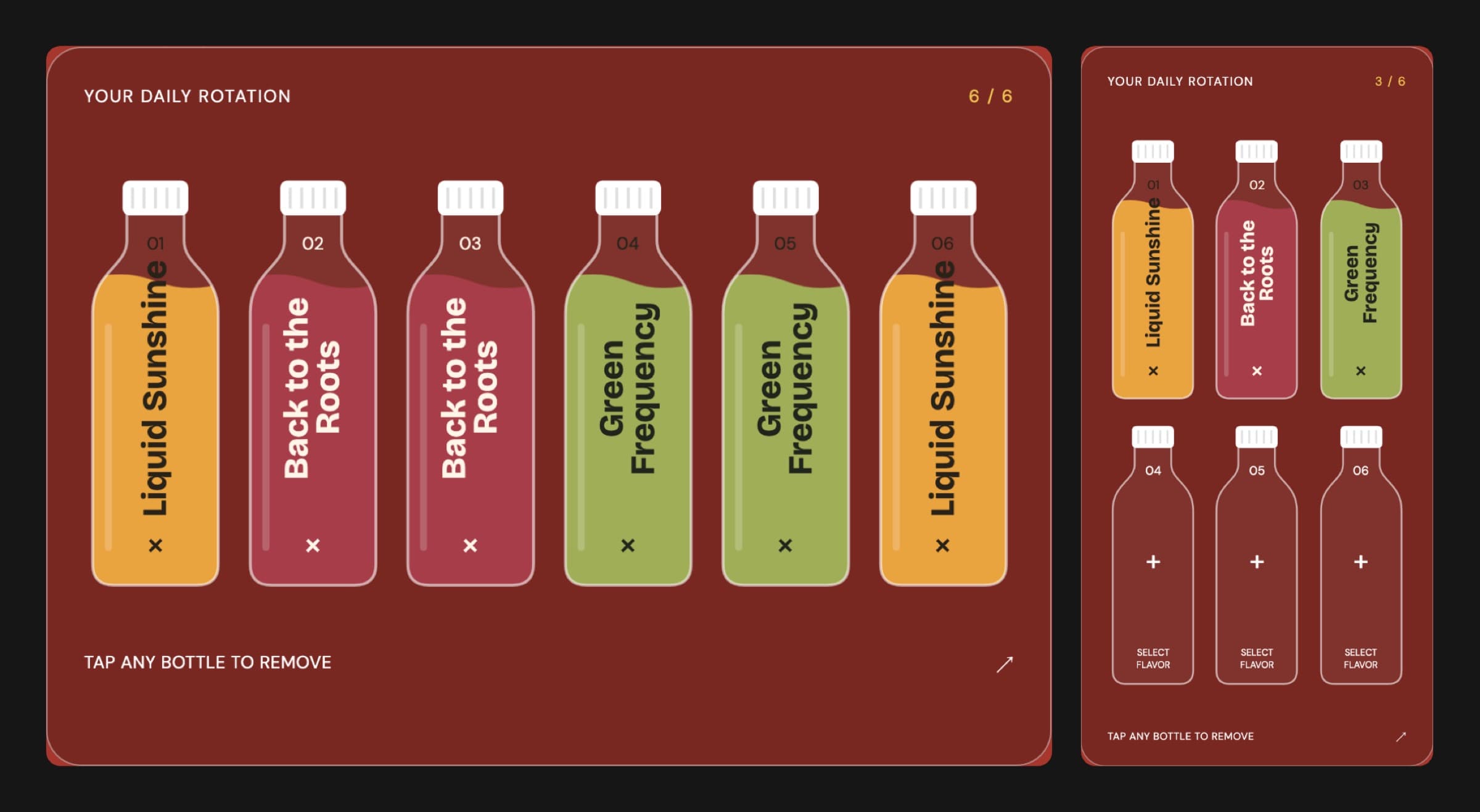
Six bottle silhouettes fill with each flavor's color as it's added, a counter shows what's left, and any filled bottle can be tapped to remove it. Adding the pack unlocks only when all six are filled.
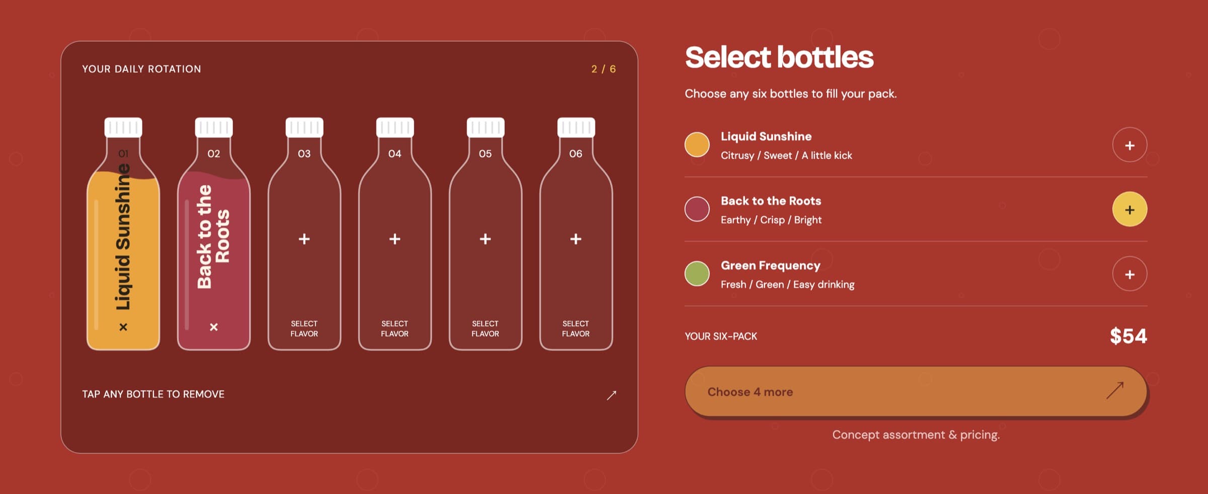
Every bottle is labelled as well as colored, so the pack never relies on color alone. On phones the six slots reflow into two rows of three.
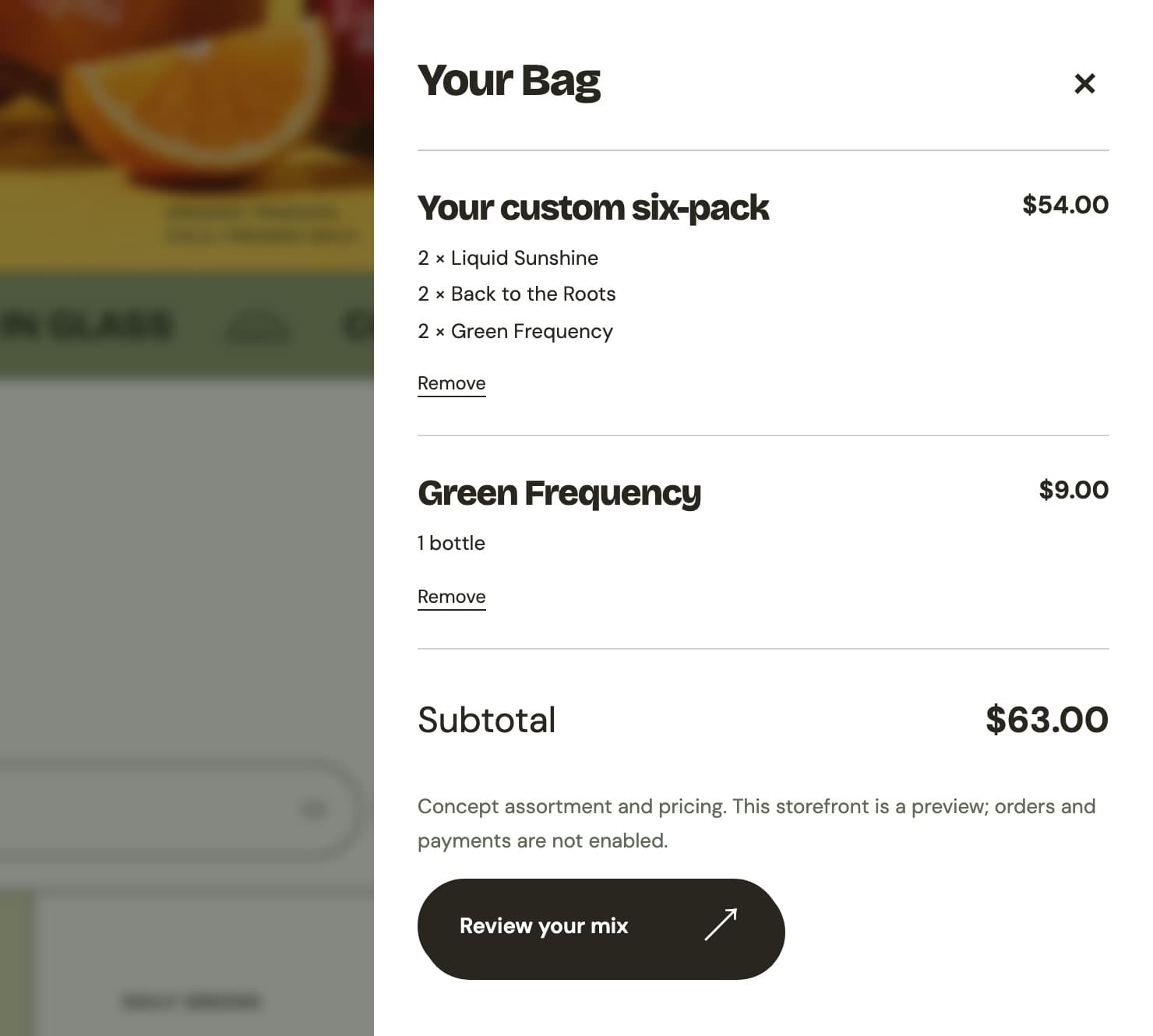
A finished pack goes to the bag as one item with its flavor counts, and the builder resets for the next one.
Refining motion through feedback
My design director at Digital NEST pushed me toward more intentional design, especially motion that earns attention. That shaped the later iterations, most of all toward the bottom of the page.
The closing sequence is the clearest result. As you scroll, a lemon descends, rotates, squeezes and releases a drop that ripples in a cup beside the final call to action.
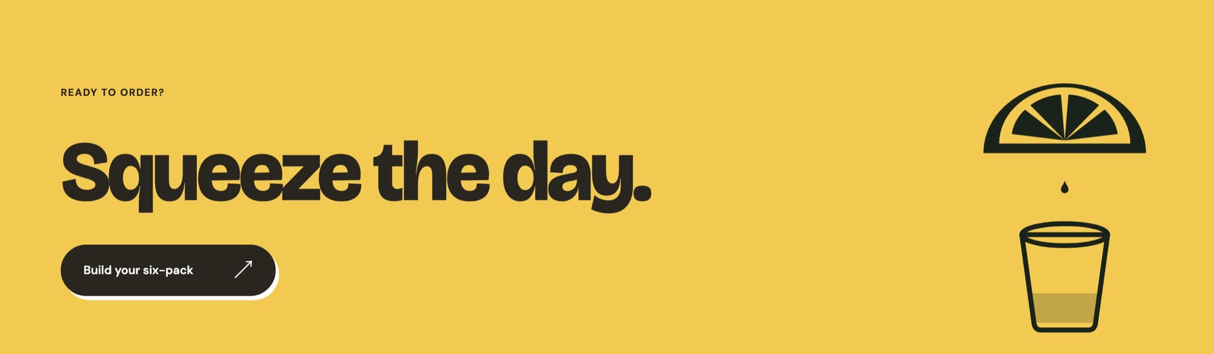
Elsewhere, motion explains change: the outgoing bottle turns edge-on before the next one appears, and pack slots fill as you choose. With reduced motion on, the decorative scene stays still and transitions are removed.
Engineering the interactions
Native HTML, CSS and JavaScript modules, with no framework or bundler. HTML holds the sections and the native bag dialog, CSS the visual system and responsive layouts, and JavaScript the selection, pack, bag and motion state.
- Reliable image changes: bottle images decode before a transition starts, and a revision counter cancels older requests when a newer flavor is chosen. The turn is flat images and CSS 3D transforms, not a 3D model.
- Focused animation: the pack keeps unchanged slots in place, so adding a bottle doesn't restart every fill and removing one doesn't replay the pour.
- Separate draft and bag state: a finished pack is copied into the bag before the draft clears, and single bottles and packs keep distinct entry types.
- Scroll coordination: the closing scene runs on an intersection observer and animation frames, and the drop's landing point is measured from the cup, so it adapts to the layout.
async function setFlavor(flavor) {
  const request = ++revision;
  running?.cancel();
  // Decode before turning so a slow connection cannot reveal an empty bottle slot.
  await preload(flavor.image);
  if (request !== revision) return false;

  running = image.animate(turnEdgeOn, { duration: 230, fill: "forwards" });
  await running.finished;
  if (request !== revision) return false;

  image.src = flavor.image;
  image.alt = flavor.imageAlt;
  // ...then turn back to face the visitor
}Accessibility is part of the build: arrow, Home and End keys for the flavor tabs, visible focus, labelled pack controls, live progress announcements and a native modal dialog.
Working with AI
I used AI to extend what I could execute while keeping the direction mine: the visual language, section structure and UX flow. AI assisted with image generation, the six-pack mechanic and complex interactions such as the bottle fill.
Directing and refining that output toward a clear vision is part of the work, and I credit it as such.
Outcome and next steps
The result is a complete front-end journey, from brand introduction to flavor exploration, pack building and bag review, responsive from phone to desktop and shaped by feedback from Digital NEST. I reached out to Juiced about the concept, and it stands as an independent exploration.
Next, I'd confirm the real assortment, pricing and ordering needs, test the pack builder with people, check keyboard and mobile use, and measure what the imagery and motion cost in performance.
The biggest lesson: keep asking what each visual element contributes, then let real behavior answer it.